Data Handing
Category : 5th Class
LEARNING OBUJECTIVE
This lesson-will help you to:—
Historical preview
QUICK CONCEPT REVIEW
There are so many things and works in our lives. We all manage and collect the details of the work we do. Every office keeps the records. We need to collect the information and there is even more need to arrange' that information. We need to do grouping of the data collected. We cannot keep the information ungrouped as it will be very difficult to retrieve any information at the time of need...
We shall learn about some of the ways to group or to handle the data.
(1) Making the table: The first step to group any data is to make a table category wise.
For example: Rajesh threw a dice twenty times.
The outcomes were:
5,344,5,6,3,2,4,4,5,5,5,2,1,6,5,3,6,6
If we want to see which number appeared how many times it becomes a bit difficult to count each number? So we can group them as follows:
First of all we see how many numbers are there which are appearing. As we know there are 6 faces of the dice so there will be numbersl.2, 3,4,5,6 which will be appearing. Each time the number appears we put a mark | in front of that number. So I means 1, || means 2, ||| means 3, III means 4 and we represent 5 as \[\bcancel{||||}\] so 6 will be \[\bcancel{||||}|\] and so on. These symbols are called tally marks.
Some Terms
So the table will be as follows; (This table is called frequency distribution table.)
|
Number on the dice |
Tally marks |
Frequency |
|
1 |
||| |
3 |
|
2 |
|| |
2 |
|
3 |
||| |
3 |
|
4 |
|| |
2 |
|
5 |
\[\bcancel{||||}|\] |
6 |
|
6 |
|||| |
4 |
|
Total |
|
20 |
Now if you are asked how many times the number appeared/ you can easily see from the table and tell that the number 5 appears 6 times.
Now you can easily make a frequency distribution table for the marks obtained or the number of different types of fruits that different people like,
(2) Bargraphs: It is the diagrammatic representation of the tabular information.
For example: If we have information about the monthly expenditure on different items in a house, we can represent the information through a bar graph.
|
Items |
Food |
Education |
Clothes |
Travelling |
Savings |
|
Expenditure |
1500 |
1000 |
1200 |
500 |
1000 |
The bar graph representing the above information will be:
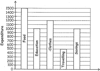
While preparing the bar graph these points should be considered:
If you have marks obtained by any of your classmate in different subjects, then you can prepare a bar chart as follows:
Data: Mathematics \[\to \] 90; Science \[\to \] 80; English \[\to \] 85;
Hindi \[\to \] 80; Computer \[\to \] 60; S. St -> 75
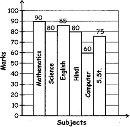
Now by looking at the bar chart you can answer any question related to this.
Example 1. In which subject the marks are maximum?
(a) Science (b) Computer
(c) Mathematics (d) S.St
Solution (c) In Mathematics the marks are maximum. (90).
Example 2. In which two subjects the marks are equal?
(a) Mathematics and science
(b) Computer and S.St
(c) English and Hindi
(d) Science and Hindi
Solution (d) in Hindi and science marks are equal (80 in each).
Example 3. What is the difference between the highest and the lowest marks obtained?
(a) 30 (b) 45
(c) 23 (d) 60
Solution, (a) Highest marks: 90; lowest marks: 60 So the difference is 90 - 60 = 30.
Example 4. Growth chart: There is one more type of graphs. Here is some information regarding the number of students taking admissions in a college during a week.
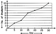
Now looking at the growth graph you can answer the question:
During which days there were maximum numbers of admissions?
|
DAY |
No. OF STUDENT |
DAY |
`NO. OF STUDENT |
|
0 |
0 |
20 |
7 |
|
5 |
2 |
25 |
8 |
|
10 |
3 |
30 |
10 |
|
15 |
6 |
|
|
(a) 0-5 (b) 10-15
(c) 25-30 (d) 20-25
Solution (c) There was maximum numbers of admissions during days 25-30.


You need to login to perform this action.
You will be redirected in
3 sec