Category : 6th Class
ADVERTISEMENT
Advertising is bringing a product or service to the attention of potential and current customers. It is focused on one particular product or service. Thus, an advertising plan for one product might be very different from that for another product. Advertising is typically done with signs, brochures, commercials, direct mailings or e-mail messages, personal contact, etc.
Advertising is the activity of drawing public attention to a product or service in order to encourage people to buy it.
CREATING AN ADVERTISEMENT
It seems very difficult to craft a perfect advertisement to entice potential consumers or influence public opinion. But the right way to make a good advertisement is to keep simple. An advertisement sums up everything that is smart, innovative, and distinguished about your brand, and is almost indispensable in today's economic marketplace.
WRITING THE ADVERTISEMENT
Advertisers create ads for an intended audience. They have a purpose behind designing an advertisement and publishing it in a particular way. Advertising affects people in different ways. People today are exposed to a large amount of advertising.
A catchy, snappy tagline is the sole of an advertisement. Loud sounding advertisements appeal less to our senses. The immediate purpose of advertisement is to garb the consumer's attention and convince him or her that your product is different from others.
AVOID THE SAME OLD CLICHES
Being memorable is the key to good advertisement. Avoid terms like— new and improved, guaranteed, or free gift-is there any other kind?
These include:
Remember: it needs to appeal to your audience as much as possible and avoid offending or talking down to them. Kids tend to be over-stimulated, meaning you will need to grab their attention on multiple levels (colour, sound, imagery). Young adults appreciate humour and tend to respond to trendiness and peer influence. Adults will be more discerning and respond to quality, sophisticated humour, and value.
LANGUAGE IN ADVERTISING
In advertising nothing is left to chance - definitely not the choice of words!
There are a number of effective ways to plant messages firmly into customers' brains, here are some of them:
(1) Power of three - the tripartite motto: Hendiatris (Greek for one through three) is a figure of speech used for emphasis, in which three words are used to express one idea. Three certainly most common "tool" of any kind of advertising—(commercial, political, rhetorical,...). Later brain research proves that the human brain tends to organize information into groups of three.
Example: Grace - Space - Pace (Jaguar)
(2) Quotations: Sayings of famous people or quotes from literary works are frequently implemented into advertising. Sometimes directly, sometimes slightly altered.
Example: Veni, vidi, Visa (adapted from Cesar, veni, vidi, vici!)
(3) Imperatives, comparatives, questions
Grammatical structures are also included in the tool-box of advertisers.
Example:
(4) Simplifications/Abbreviations
Advertisers are rather creative when it comes to making speech easier and shorter.
Example: Tm lovin it!, Toys 'R' Us
(5) Rhyme/Alliteration
Speech patterns like these are used to make slogans even more memorable. An alliteration is a sequence of words that all start with the same letter.
Example: O2 can do!, Snickers satisfies!
(6) Surprise/Provocation
The unexpected is always a successful way to be remembered.
Example: You don't have to be silly to drink TK, but it helps! (Taylor Keith, red lemonade)
Geiz ist geil!/Blodmann!
GRAPHS
Graphs, charts, and tables are ways of presenting information. Graphs and charts are pictures which show numbers or figures, and tables are just rows and columns of information.
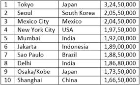
This is a table. It shows the population of the world's top ten cities in 2011.
One of the most important things to do is get the main idea of the graph. First, identify the main features of the graph. What is happening? What are the biggest numbers? If it is a time graph, what are the biggest changes?
What are the trends?
Ideally you need to find one main idea and, if possible, one or two smaller ideas.
GROUPING INFORMATION
Sometimes there is just too much information in a graph. You may need to group information. Grouping information means putting two or three similar or related things together.
This makes it easier for the reader to understand. It is also less work for you, because you can put more than one piece of information in a sentence.
MAKE GROUPS
For example, you might be able to divide a list into three groups. Often there is one group at the top, one in the middle, and one at the bottom. Look at the graph below, which shows the number of Internet users in European countries in 2000.
Number of Internet Users per 100 people
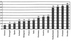
Possible groups could be
Top: Finland, Sweden, Netherlands, and Denmark (about 40 users per hundred)
Group 2: Germany, Austria, UK (about 20 to 25 users per hundred)
Group 3: Ireland, Belgium, France and Italy (14-16 users)
Group 4: Spain, Portugal, Greece (less than 10% Internet users)
GRAPHS: VOCABULARY
Movement (Verbs): Up
Movement (Verbs): Down
Prepositions
Adverbs and Intensifiers
No Movement: (Verbs with Adjectives, Verbs)
Tops and Bottoms
The Vocabulary of Numbers
There are some special words for numbers, fractions and percentages.
Look at the following table which shows a number in different years (1990-1995):
| 1990 | 1995 |
| 1200 | 1800 |
You could describe the above table using numbers, fractions or percentages:
| 1992 | 1994 | 1996 | 1998 |
| 500 | 1000 | 3000 | 12000 |
Use "trebled,” “-fold,” and "times:”
| 1992 | 1994 | 1996 | 1998 |
| 1000 | 800 | 400 | 100 |
Use Fractions:
Vocabulary Tips
TYPES OF GRAPHS
You are likely to meet only two types of graphs in English tests - time and comparison graphs. (Sometimes you can get both in the same test!)
The vocabulary for each kind of graph is different:
Time Graphs
Example: Here is a time graph.
USA Intercity Travel
billions of passengers-miles per year
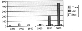
You have to compare different methods of transport used in the US over the last century - train, bus and air. You could start with:
The main trend with rail transport is that it rose to a peak in the 1920s and 1930s and then declined.
The main trend with air is that it started late, in the 1960s, but it has shot up to become by far the biggest carrier of passengers.
Comparison Graphs
Example: Here is a comparison graph.
Water Use in Gulf Countries 2000
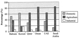
You have to compare the amount of water used for domestic, agricultural and industrial purposes.
There are two ways to write about this graph:
If you decide to write by describing use, you could start with Agriculture because it is the biggest user. Group together Saudi Arabia and Oman as the top users, and then group UAE and Qatar as the middle group of users, using 60% of water for agriculture. Finally mention Bahrain and Kuwait.
Your second paragraph should be about Domestic use, the use of water in the home, because it is the second biggest use. Start with Kuwait and Bahrain (grouped together) (more than 50%) and then write about Qatar and the UAE.
BEFORE YOU BEGIN
Underline key words. Write related words - turn nouns into verbs, verbs into nouns, adjectives into adverbs, etc. Write opposite words, similar words, synonyms, etc. Circle and highlight the graph. Use arrows. Make notes. Circle the biggest, the smallest, stable or unchanging parts, sudden increases, etc.
Identify trends. A trend is the overall idea of the graph
WHILE YOU WRITE: LAYOUT
Introduction
Paragraph 1: Trend 1
Paragraph 2: Trend 2
While You Write: Some Don 'ts
Word Length and Sentence Length
Make sure you have 150 words. You should have some short sentences (about 6-10 words) and some long ones (12-18) words, but your average should be about 12 or 13 words per sentence. A sentence without a number will usually be short. Use a mix - a sentence without a number followed by a sentence or two with a number.
IMAGES
The word image is in the broader sense means any two-dimensional figure such as a map, a graph, a pie chart or a painting. In this wider sense, images can also be rendered manually, such as by drawing, the art of painting, carving, rendered automatically by printing or computer graphics technology, or developed by a combination of methods, especially in a pseudo-photograph.
A volatile image is one that exists only for a short period of time. This may be a reflection of an object by a mirror, a projection of a camera obscura, or a scene displayed on a cathode ray tube. A fixed image, also called a hard copy, is one that has been recorded on a material object, such as paper or textile by photography or any other digital process.
A mental image exists in an individual's mind, as something one remembers or imagines. The subject of an image need not be real; it maybe an abstract concept, such as a graph, function, or "imaginary" entity. A still image is a single static image, as distinguished from a kinetic image. This phrase is used in photography, visual media and the computer industry to emphasise that one is not talking about movies, or in very precise or pedantic technical writing such as a standard.
Our ancestors used pictures and images to communicate. The advertising world has always relied on powerful imagery to tell a marketing story. And then there is that old saying: "A picture is worth a thousand words".
PROPER USAGE OF IMAGES
Obviously this growing trend means we need to use visuals to do more of the talking for us. But along with this growing popularity is the proper usage of images in your marketing efforts. Here are five usage guidelines for you to consider.
Example:

Description: This advertisement shows a simple gray car in a gray background. The big words say, "The Only One You'll Need." The smaller text says, "Experience the freedom and peace of mind knowing you've made a great investment. Essentially, you are buying a car for life. Twenty years from now it will still get you from point A to B."
Interpretation: It seems that the message is clear that this car will last a long time. The text, "Experience the freedom and peace of mind knowing you've made a great investment," seems to speak to older people who think responsibly about their purchases. It seems to say that this is the smart thing to do. Also, when it says that it gets you from "Point A to B" seems to mean that the most important consideration in buying a car is reliability. Because of this, this ad is definitely meant for older people (age 50+).


You need to login to perform this action.
You will be redirected in
3 sec