Category :
8th Class
Statistics
Learning Objectives
- Data Handing
- Introduction to Graphs
Data Handling
- Pictograph: A pictograph is a way of showing data using images.
- The number of times that a particular entry occurs in a data is called its frequency.
- In the class interval, 10-20, 10 is called the lower class limit and 20 is called the upper class limit.
- The difference between the upper class limit and lower class limit is called the width or size of the class interval.
Introduction to Graphs
- Bar Graph: It is a display of information using bars of uniform width, their heights being proportional to the respective values.
- Double Bar Graph: It is a type of bar graph showing two sets of data simultaneously. It is useful for the comparison of the data.
- Histogram: A histogram is a bar graph that shows data in intervals. It has adjacent bars over the continuous intervals.
- Pie graph: The representation of data on a pie chart is called a pie graph. It is used to compare parts of a whole.
- A line graph displays data that changes continuously over periods of time. It is a whole unbroken line.
- For fixing a point on the graph sheet we need, x-coordinate and y-coordinate.
- The relation between dependent variable and independent variable is shown through a graph.
Commonly Asked Questions
1. Observe the following histogram and answer the questions.
2. What information is being given by the graph?
(a) Height of the students of class 8
(b) Number of students in class 8
(c) Weight of the students of class 8
(d) All of these
(e) None of these
3. The following pie-chart represents the expenditures of a family on different items. What percent of total expenditure is spent by the family on housing?
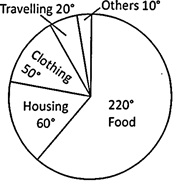
(a) 61% (b) 16.7%
(c) 13.9% (d) 12.7%
(e) None of these
Answer: (b)
Explanation: Percentage expenditure on housing \[=\frac{60{}^\circ \times 100}{360{}^\circ }=16.7%\]