Data Handling
Category : 5th Class
Data Handling
Learning Objectives
Introduction
Everyday we come across a lot of information in the form of numerical figures, tables and graphs. These are provided by newspapers, televisions, magazines and other means of communication. These may relate to cricket batting or bowling average, temperatures of different cities, etc. The graphs are prepared with the help of data. Data are collected through survey or other means. Then data are arranged in ascending or descending order using a table. In this chapter, we will study about graphs, how to make the graphs and how to extract information’s contained in by the graphs.
Data
Collection of information’s in the form of numerical figures in a survey is called data. The initial data that observer collects himself is called raw data. To extract the information’s contained in by the data are arranged in ascending or descending order using tables. The raw data that have been arranged or organized by constructing a table are called grouped data. Data can be represented graphically to give dear idea of what it represent, it is easier to interpret and organise data using pictorial representation. Some of the ways data can be represented pictorially are:
Bar Graph
A bar graph is a chart that uses bars to show comparisons between categories of data. It is an another type of graph used for showing data or information in a quick way. The bars can be either vertical or horizontal. Bar graph with vertical bars are sometimes called vertical bar graphs.
Following bar graph represents the number of tickets sold by each class for a secondary school staged play to raise funds for its institution.
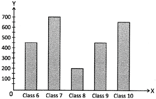
Read the graph carefully and answer the following questions:
(a) 400 (b) 450
(c) 500 (d) 550
(e) None of these
Answer: (b)
Explanation: Number of tickets sold by class \[10=650\]
Number of tickets sold by class \[8=200\]
Difference \[=650200=450\]
Therefore, 450 more tickets are sold by class 10 than class 8.
(a) Class 8 and class 10
(b) Class 6 and class 7
(c) Class 7 and class 8
(d) Class 6 and class 9
(e) None of these
Answer: (d)
Explanation: By seeing bar graph, we find that the number of tickets sold by class 6 and class 9 are equal which is 450.
(a) 450 (b) 550
(c) 500 (d) 600
(e) None of these
Answer: (c)
Explanation: By seeing bar graph, we find that the highest number of tickets sold by the class 7 is 700 and the least number of tickets sold by the class 8 is 200.
Hence, the required difference \[=700-200=500\] tickets
(a) 2250 (b) 2450
(c) 2000 (d) 2500
(e) None of these
Answer: (b)
Explanation: Number of tickets sold by class 6 = 450
Number of tickets sold by class 7 = 700
Number of tickets sold by class 8 = 200
Number of tickets sold by class 9 = 450
Number of tickets sold by class 10 = 650
Hence, the required sum \[=450+700+200+450+650=2450\]
Line Graph
A line graph compares two variables, which is drawn just with lines instead of pictures or bars. A line graph shows information that is connected in some way (such as change over time). Thus, a line graph is used to show gradual changes in the information.
The line graph shows the amount of petrol Rahul used and the distance the car travelled. Observe the graph and answer the following questions:
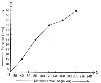
1.
(a) 3 litres (b) 5 litres
(c) 10 litres (d) 15 litres
(e) None of these
Answer: (b)
Explanation: Amount of petrol used for 120 km travelled = 50 litres
Amount of petrol used for 160 km travelled = 55 litres
Therefore, the required difference = 55 litres - 50 litres = 5 litres.
(a) 100 m (b) 75 km
(c) 125 km (d) 60 km
(e) None of these
Answer (a)
Explanation: Seeing the line graph, we find that distance travelled when 40 litres of petrol was from 80 km to 120 km. So, the likely distance travelled when 40 litres of petrol was used is 100 km.
Pie Chart
A pie chart is a circular graph that uses 'pie slices' to show relative sizes of data. In a pie chart, a circle is divided into the required number of parts or slices to give information. The size of each part of the circle depends on the size of information.
The pie chart below shows the percentages of blood types for a group of 300 people.
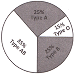
Observe the pie chart and answer the following questions:
(a) 35 (b) 40
(c) 55 (d) 45
(e) None of these
Answer: (d)
Explanation: Percentage for the number of people having blood type O = 15%
Total number of people \[=300\]
The required number of people = 15% of \[300=\frac{15\times 300}{100}~=45\].
(a) 205 (b) 195
(c) 185 (d) 175
(e) None of these
Answer: (b)
Explanation: Percentage for the number of people having blood type AB = 35%
Total number of people \[=300\]
Number of people having blood type AB = 35% of 300
= \[\frac{35}{100}\times 300=35\times 3=105\]
Therefore, the number of people in this group do not have blood type
AB = 300 - 105 = 195
Also, the percentage for the number of people which do not have blood type
AB = (100 - 35) % = 65%
So, the number of people in this group do not have blood type
AB = 65% of \[300=\frac{65\times 300}{100}~=195\].
(a) 20 (b) 25
(c) 35 (d) 30
(e) None of these
Answer (d)
Explanation: Total number of people = 300
Percentage of people having blood type O = 15%
Number of people having blood type O = 15% of \[300=\frac{15}{100}\times 300=45\]
Percentage of people having blood type B = 25%
Number of people having blood type B = 25% of \[300=~\frac{25}{100}\times 300=75\]
Therefore, difference in numbers \[=75-45=30\]
So, there are 30 more people who have blood type B than blood type O.
Commonly Asked Question
(a) Lines (b) Bars
(c) Pictures (d) Pies
(e) None of these
Answer: (b)
Explanation: In a bar graph, bars can be drawn horizontally or vertically.
Direction (2 to 4): The following graph represents the number of railway tickets sold for different cities at a railway ticket counter in 6 hours on a particular day.
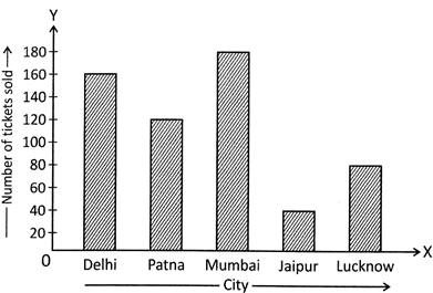
Read the bar graph and answer the following questions:
2. In which city, the number of tickets sold were less than 150 but more than 100?
(a) Delhi (b) Jaipur
(c) Patna (d) Lucknow
(e) None of these
Answer: (c)
Explanation: Number of tickets sold in Delhi = 160
Number of tickets sold in Patna = 120
Number of tickets sold in Lucknow = 80
Therefore, in Patna, the number of tickets sold more than 100 but less than 150.
3. There are 140 tickets in Mumbai than ____.
(a) Patna (b) Jaipur
(c) Delhi (d) Lucknow
(e) None of these
Answer: (b)
Explanation: Number of tickets sold in Mumbai = 180
Given number of tickets = 140
Now, difference of 140 and 180 is \[180-140=40\]
Clearly, there are 40 tickets sold in Jaipur.
4. How many tickets were sold in all?
(a) 620 (b) 540
(c) 580 (d) 560
(e) None of these
Answer: (c)
Explanation: Number of tickets sold in Mumbai = 180
Number of tickets sold in Delhi = 160
Number of tickets sold in Patna = 120
Number of tickets sold in Jaipur = 40
Number of tickets sold in Lucknow = 80
So, there are \[\left( 180+160+120+40+80 \right)=580\] tickets sold in all.
Direction (5 to 7): Following line graph tells us about the number of people in a shopping mall at various times of the day.
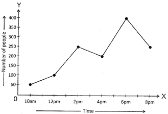
Read the line graph and answer the following questions:
5. What is the busiest time of day at the store?
(a) 6 pm (b) 10 am
(c) 4 pm (d) 2 pm
(e) None of these
Answer: (a)
Explanation: Line graph shows, there are 400 people in the shopping mall at 6 pm which is the maximum. So, 6 pm is the busiest time.
6. How many people are there in the mall when it closed?
(a) 200 (b) 300
(c) 350 (d) 250
(e) None of these
Answer: (d)
Explanation: The shopping mall closed at 8 pm and there are 250 people at 8 pm in the shopping mall.
7. In which times duration, there are about 150 people in the mall?
(a) 12 pm to 2 pm (b) 2 pm to 4 pm
(c) 4 pm to 6 pm (d) 6 pm to 8 pm
(e) None of these
Answer: (a)
Explanation: Seeing line graph, we find that there are 100 people at 12 pm and 250 people at 2 pm and also, 200 people at 4 pm.
Therefore, about 150 people are there in the mall in between 12 pm to 2 pm.


You need to login to perform this action.
You will be redirected in
3 sec