Data Handling
Category : 6th Class
Data Handling
In this chapter we will learn about pictograph and bar graph.
Data
Data is a collection of facts, such as numbers, observations, words or even description of things.
Observation
Each numerical figure in a data is called observation.
Frequency
The number of times a particular observation occurs is called its frequency.
Statistical Graph
The information provided by a numerical frequency distribution is easy to understand when we represent it in terms of diagrams or graphs.
To represent statistical data, we use different types of diagrams or graphs. Some of them are:
(i) Pictograph
(ii) Bar graph
Pictograph
A pictograph represents the given data through pictures of objects. It helps to answer the questions on the data at a glance.
The following pictography shows the number of cakes sold at a bakery over five days.
|
Days |
Number of cake |
|
|
Monday |
|
|
|
Tuesday |
|
|
|
Wednesday |
|
|
|
Thursday |
|
|
|
Friday |
|
|
Based on above pictography answer the following questions:
I. On which day, the maximum number of cakes were sold?
(a) Monday (b) Tuesday
(c) Wednesday (d) Friday
(e) None of these
Answer (a)
Explanation: Clearly from the pictograph, we can say that on Monday the maximum number of cakes were sold.
II. How many total number of cakes were sold over five days?
(a) 150 (b) 160
(c) 170 (d) 180
(e) None of these
Answer (d)
Explanation: Total number of cakes sold over five days.
\[=\text{ }50\text{ }+\text{ }30\text{ }+\text{ }35\text{ }+\text{ }20\text{ }+\text{ }45\text{ }=\text{ }180\]
Bar Graph
A bar graph is a pictorial representation of numerical in the form of rectangles (or bars) of equal width and varying lengths. The lengths (or heights) of a rectangle depends upon the number it represents. The distance between each rectangle remains same.
Note:
The bar graph given below represents the sales of books (in from five branches of a publishing company during a year
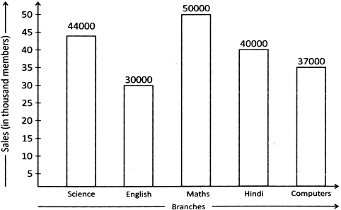
Sales of books (in thousand numbers) from five branches Science, English, Maths, Hindi and Computers of a publishing company daring a year.
Based on above information answer the following questions.
I. What is the ratio of sales of books of Hindi to the sales of books of science?
(a) 1 : 11 (b) 10 : 11
(c) 3 : 5 (d) 4 : 7
(e) None of these
Answer (b)
Explanation: Clearly, from the bar graph, we get required ratio = 40000 : 44000 = 10 : 11
II. What is the difference between the maximum and minimum number of books in that year?
(a) 10,000 (b) 20,000
(c) 30,000 (d) 40,000
(e) None of these
Answer (b)
Explanation: Required difference = 50000 - 30000 = 20000


You need to login to perform this action.
You will be redirected in
3 sec