Answer:
Indifference map is a family of collection of indifference curves that depicts the different levels of satisfaction and preferences of a consumer. Each indifference curve in an indifference map depicts a particular level of satisfaction. Higher IC denotes higher level of satisfaction and lower IC denotes lower level of satisfaction. 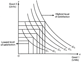
The above figure depicts an Indifference Map comprising of six indifference curves (from \[I{{C}_{1}}\] to\[I{{C}_{6}}\]). As the consumer moves farther away from \[I{{C}_{1}}\] to higher indifference curves the level of satisfaction derived by the consumer increases. \[I{{C}_{6}}\]Depicts the highest level of satisfaction. On the other hand, \[I{{C}_{1}}\] depicts the lowest level of satisfaction. An indifference curve is downward sloping from left to right. It implies that a consumer cannot simultaneously have more of both the goods. An increase in the quantity of one good is associated with the decrease in the quantity of the other good. This is in accordance with the assumption monotonic preferences.


You need to login to perform this action.
You will be redirected in
3 sec