Category : 7th Class
Learning objective
INTRODUCTION
Extraction of meaningful information by collection of data, organising, summarizing, presenting and analyzing the data is a branch of mathematics called statistics. Data is defined as the particular information in numeric form.
PRIMARY DATA
If the data is collected by the investigator herself/himself with the specific purpose, then such data is called the primary data.
SECONDARY DATA
If the data collected by someone else other than investigator are known as secondary data.
GROUPED DATA
The data can be represented into classes or groups. Such a presentation is known as grouped data. Firstly it may arrange in ascending or descending order and then divide into groups.
RAW DATA
Raw data is the data which is not arranged in any particular fashion or pattern. It is the original form of data.
FREQUENCY
It is a number which tells that how many times does a particular observation appear in a given data.
For example:
In a data 5, 1, 4, 5, 1, 3, 2, 2, 5, 1, 1, 6, 4, 3, 4, 7, 6 the frequency of 1 in this data is 4 because it occurs four times in the observation.
The observation having maximum frequency is known as mode. For example: 7, 6, 5, 5, 4, 3, 2, 2, 5, 1, 3.
5 occurs three times in the given data.
\[\therefore \] 5 is the mode.
FREQUENCY DISTRIBUTION
A tabular arrangement of data sharing their corresponding frequencies is called a frequency distribution.
CLASS INTERVAL
The group in which the raw data is condensed is called a Class interval. Each class is bounded by two figures.
GROUPING OF DATA
Let us observe the marks obtained by 25 students in Mathematics as follows:
56, 31, 41, 64, 53, 56, 64, 31, 88, 53, 28, 33, 70, 70, 61, 74, 74, 64, 56, 32, 53, 53, 56, 61, 53.
We observe that there are few students who get same marks, e.g., 74 marks is obtained by 2 students, 53 is obtained by 5 students etc. Let us represent them in a frequency distribution table given below:
|
Marks |
Tally Marks |
Frequency |
|
28 |
| |
1 |
|
31 |
|| |
2 |
|
32 |
| |
1 |
|
33 |
| |
1 |
|
41 |
| |
1 |
|
53 |
5 |
|
|
56 |
|||| |
4 |
|
61 |
|| |
2 |
|
64 |
||| |
3 |
|
70 |
|| |
2 |
|
74 |
|| |
2 |
|
74 |
|| |
2 |
|
88 |
| |
1 |
|
|
|
Total = 35 |
Here, we see that the lowest marks is 28 and the highest marks is 88.
We can further group them into classes as given below:
|
Classes |
Tally Marks |
Frequency |
|
25-35 |
5 |
|
|
35-45 |
| |
1 |
|
45-55 |
5 |
|
|
55-65 |
||| |
9 |
|
65-75 |
|||| |
4 |
|
75-85 |
Nil |
0 |
|
85-95 |
| |
1 |
|
|
|
Total = 25 |
AVERAGE OR ARITHMETIC MEAN IS DEFINED AS FOLLOWS
\[\text{Mean}=\frac{\text{sum}\,\text{all}\,\text{observations}}{\text{number}\,\text{of}\,\text{observations}}\]
For example: Find the mean of the data: 13, 16, 12, 14, 19, 12, 11, 10 13 + 16 + 12 + 14 + 19 + 12 + 11 + 15
Sol. Mean \[=\frac{13+16+12+14+19+12+11+15}{8}\]
\[=\frac{112}{8}\]
Mean = 14
PICTOGRAPH
A pictograph is the way of representing data using pictures.
READING AND INTREPRETING PICTOGRAPH
Reading a pictograph helps in intrepreting the pictograph so as to get information from it.
(i) Find the number of people preferring Red colour.
(ii) How many liked Grey colour?
(iii) What is the ratio of the number of people preferring White colour to the number of people preferring Silver colour?
Sol. We observe from the pictograph that:
(i) The number of people preferring red colour \[=7\times 10=70\]
(ii) Number of people preferring grey colour \[=5\frac{1}{2}\,\times 10=55\]
(iii) Number of people preferring white colour \[=2\times 10=20\]
\[\therefore \] Ratio of the number of people preferring white colour to the number preferring Silver colour
= 20 : 55 = 4 : 11
BAR GRAPH
When numerical data is presented as columns on a graph, this graphical representation of data is called a bar graph.
PROPERTIES OF BAR GRAPHS
In a bar graph, the columns are drawn such that:
CONSTRUCTION OF A BAR GRAPH
Steps:
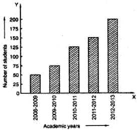
Example: The following table gives the umber of students in Class VI in a school during academic years 2008 to 2013.
|
Academic Year |
200 - 2009 |
2009 - 2010 |
2010 - 2011 |
2011 - 2012 |
2012 - 2013 |
|
Number of Students |
50 |
75 |
125 |
150 |
200 |
Represent the above data by a bar graph.
Sol.
To represent the above data by a bar graph, we first draw a horizontal and a vertical line. Since five values of the numerical data are given. So, we mark five points on the horizontal line at equal distances and erect rectangles of the same width at these points. The heights of the rectangles are proportional to the numerical values of the data as shown in Fig.
READING OF BAR GRAPHS
Reading of the bar graph is the process of interpreting the bar graph together information
Example: Read the following bar graph shown in Fig. and answer the following questions:
(i) What is the information given by the bar graph?
(ii) In which month was the sale of the book maximum?
(iii) In which month was the sale of the book minimum?
Sol.
(i) The bar graph shows the number of copies of Physics for Class XII sold by a bookseller during the period from April 2014 to August 2014.
(ii) The sale of the book was maximum in the month of April as the height of the rectangle corresponding to April month is maximum.
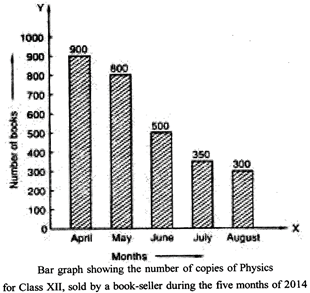
(iii) The sale of the book was minimum in the month of August as the height of the corresponding rectangle is minimum.


You need to login to perform this action.
You will be redirected in
3 sec